The Solution
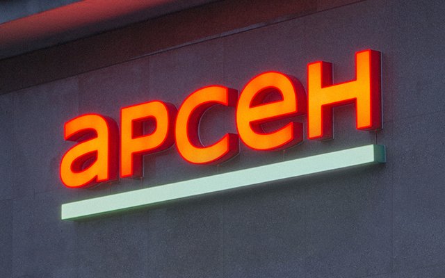
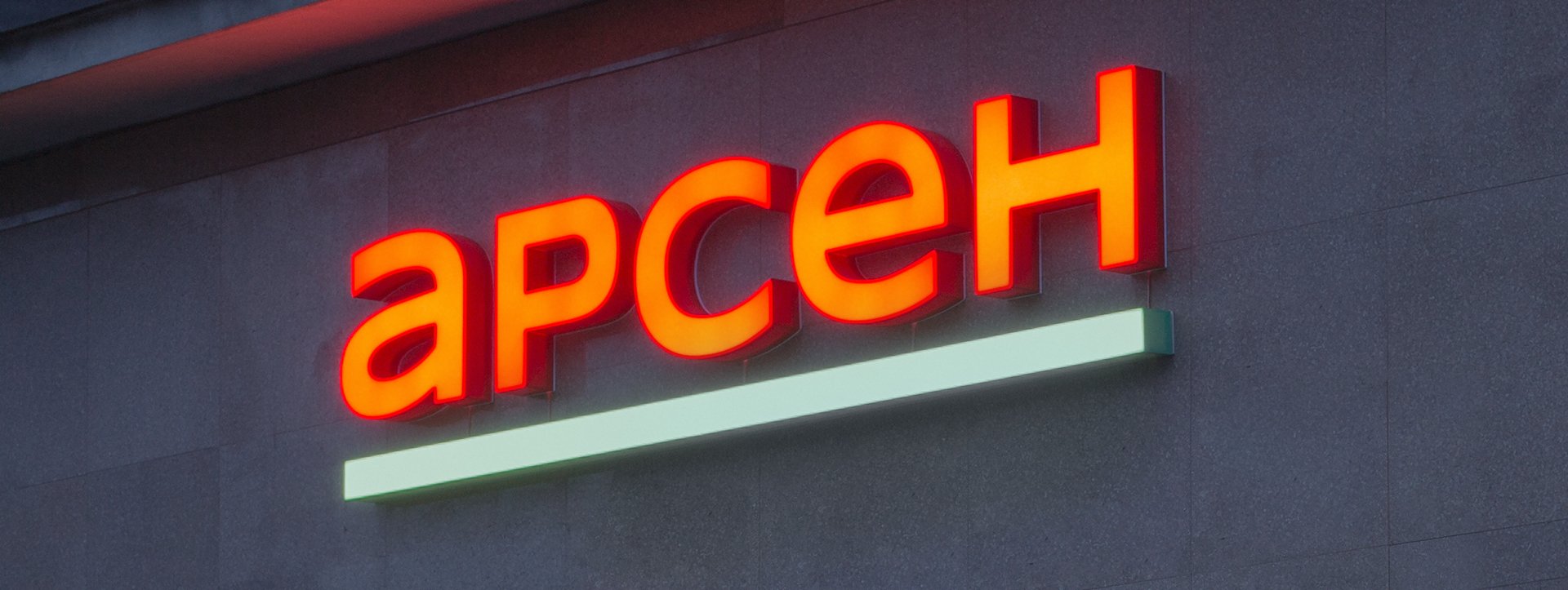
Conducting a study was the first step in our collaboration. 17 352 reviews were collected and structured, with 558 respondents interviewed online, 11 interviews conducted with company managers and executives, and 2 secret store visits. Based on our findings, we developed a strategy that aims to return and attract new customers, upgrade the existing supermarkets. Since the research showed a sufficient level of brand loyalty, it was decided to retain the logo’s distinctive features and give it a slick contemporary shade. Since our goal was for the brand to be associated with purity and freshness, it was decided to change its color scheme. A comprehensive upgrade of the brand’s visuals required working on all points of consumer interactions – from signboards, in-store navigation and price tags to advertising materials, posters, billboards, staff uniforms, packaging, and social media platforms styles.


To maximize the convenience of supermarket departments, we developed special color coding; various identifying icons, made into clothes patches were also designed for uniforms of staff working in different departments. Apart from patches, all personnel are now easily distinguished by the different designs in uniforms. Security guards, cashiers, managers and trading hall employees were given grey uniforms with a red collar, and those working in food departments – white uniforms with multicolored patches and aprons.


