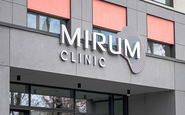
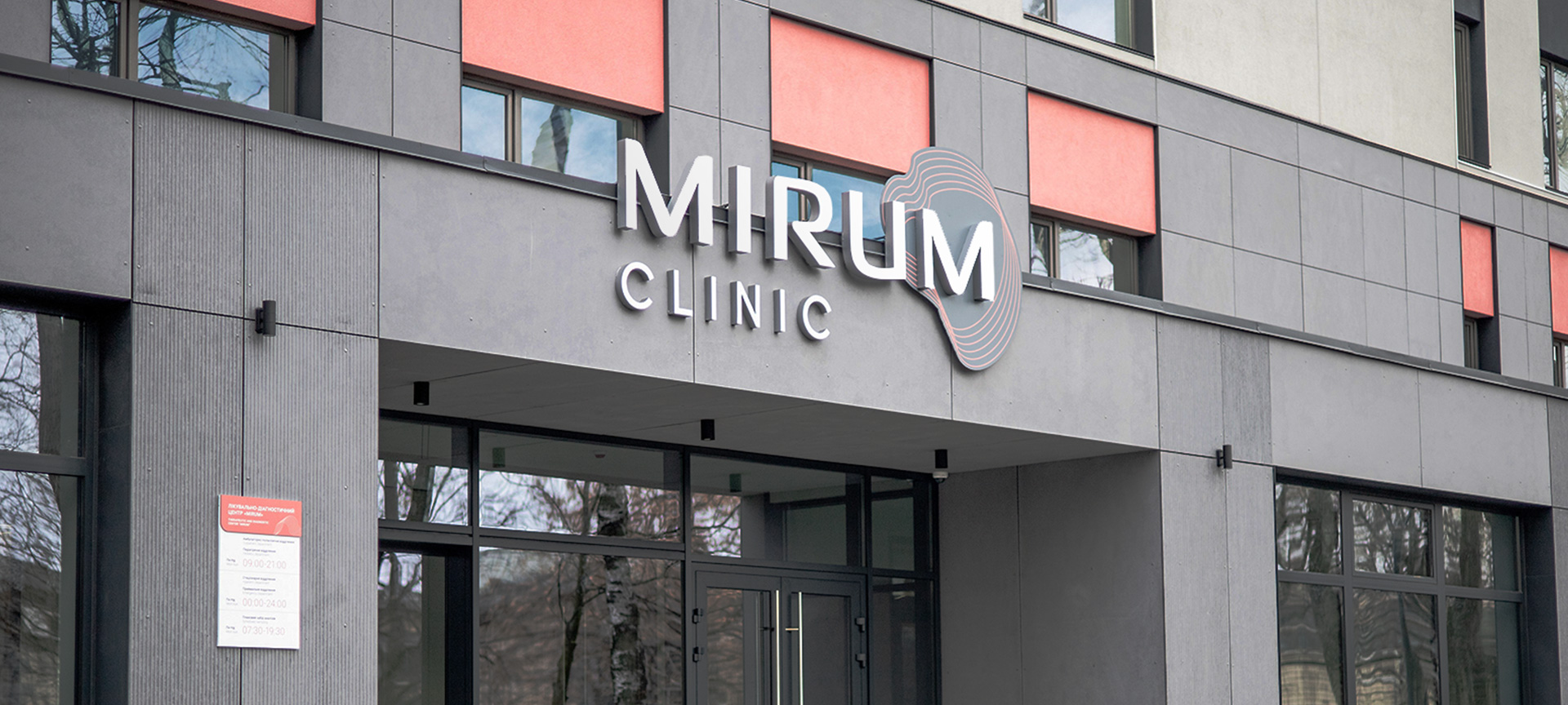

Solution
In order to visually convey the professionalism of the staff and care for patients, we combined smooth, plastic lines with strict forms in the typeface of the logo. The sign has a more philosophical meaning. This is the definition of the continuity of human life. Symbolic "rings of life", like age rings on a tree trunk, intertwine into an endless Möbius strip.


Wayfinding System
The wayfinding system of the "Mirum" clinic is built on a combination of accent light coral and background white color with a dosed addition of branded graphic elements. The numbers of floors and the names of departments in the tables are highlighted with an accent color. Such elements are placed on three-dimensional overlays on the table. This allows better visual separation of different types of information for a more intuitive perception of it by visitors to the clinic.


