Solution
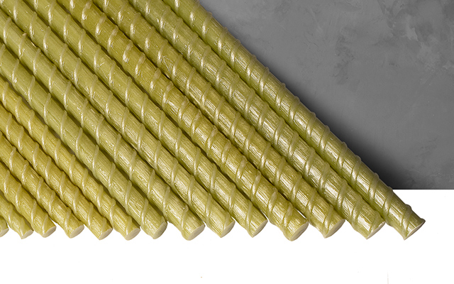
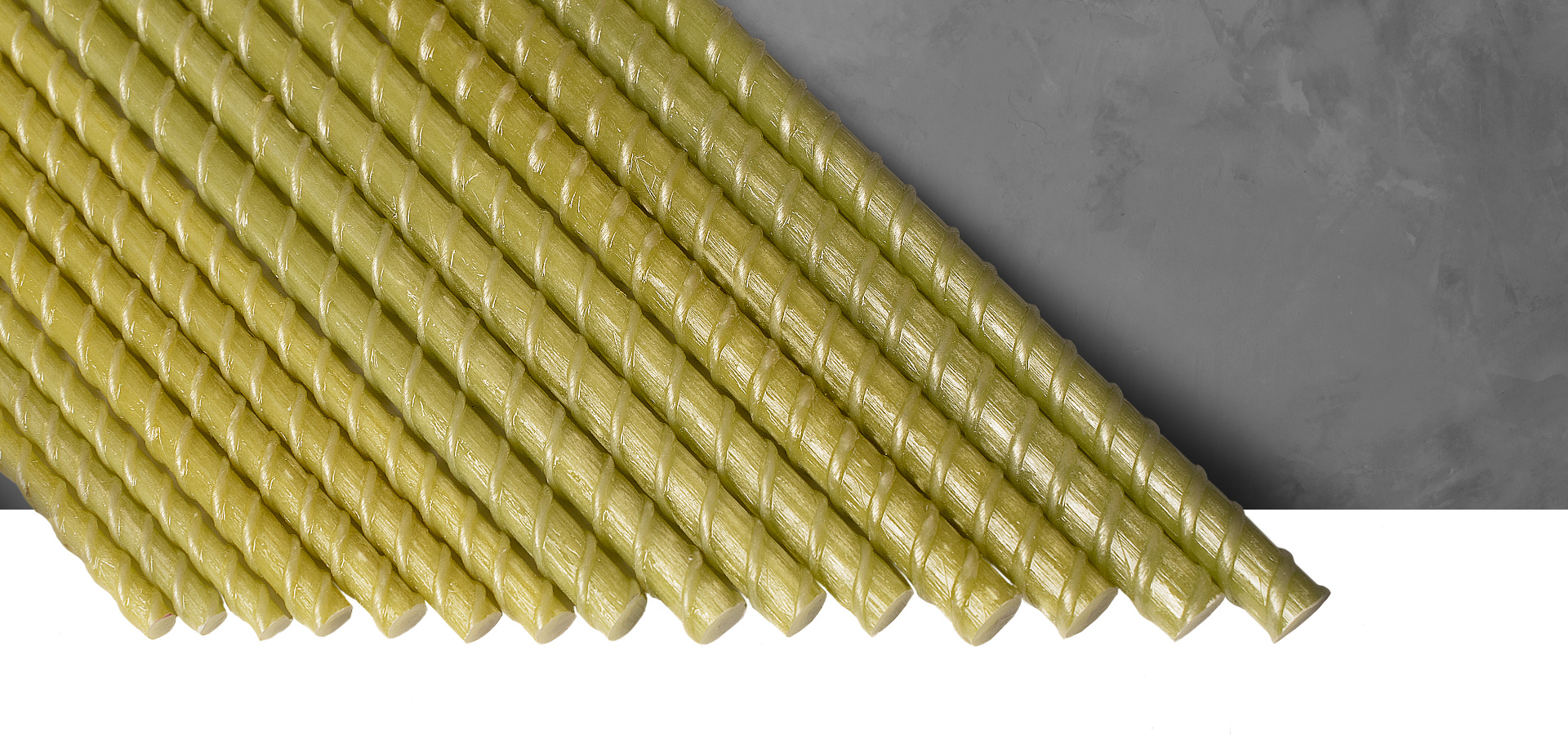
We settled on a font logo. For the inscription, a wide minimalist font with ink strips was used to add a technical aesthetic. Modernized letterforms reflect the brand's commitment to innovation. In addition, as graphic elements, we use the cross-section of the armature, directly inspired by the appearance of armature structures in construction, which further strengthens the connection between the product and its use in life. The overall style of the brand is minimalistic and balanced, conveying a sense of reliability and quality.


Website Design
The design of the REBARMAT website is a continuation of the corporate style. Here we focused on combining the technical aesthetics of the brand with functionality. Since composite reinforcement is a relatively new building material, we have devoted a lot of attention to the description of its technical characteristics, the depiction of advantages and visualization of the features of use on the site.


