
The Solution
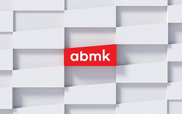
The name ‘AБMK’ was created as an abbreviation for Ukrainian words signifying "architecture", "construction", "management" and "consulting". Since over the years the list of the company's services had expanded considerably, the name itself needed to be adapted for foreign customers. In Latin alphabet this would correspond to ‘ABMK’, which in turn creates some confusion between the Latin and Cyrillic versions. To avoid incorrect spelling or transliteration, we decided on using lowercase letters instead of capital – ‘абмк’ and ‘abmk’ accordingly.


The logo combines a red banner, in the shape characteristic to the company, and the firm’s name in a concise font. Since abmk’s corporate identity is mostly seen on sheets with drawings, estimate tables and various specifications, we decided on a simplistic, restrained style that wouldn’t dominate the overall visual perception. The linear shape of the banner became the graphic element of corporate identity. ‘abmk’ is an architectural company whose core mission is to shape surrounding spaces, so in the context of their corporate style, the linear banner serves as a reflection of this idea – it outlines the space, resembling the lines of an actual architectural drawings.
