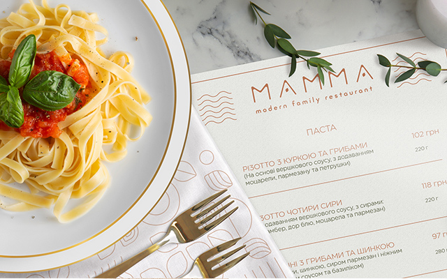
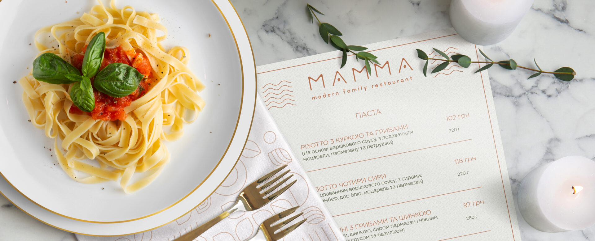
Solution
The first thing we wanted to convey is that nothing should distract you from eating. Therefore, the logo continues the concept of the institution and does not "shout" about its Italian origin. Instead, we only hinted at the concept: the letters "a" in the logo represent basil leaves or an olive berry, and the color was Cappuccino. This is how we combined minimalism and national cuisine and created a visual solution that harmoniously complements the concept of the establishment.


Pattern
The signature pattern consists of stylized elements that are closely related to the theme of food, cooking and cuisine in general. The combination of these elements in a light and unobtrusive style creates a pleasant context and appropriate mood. If necessary, you can change the arrangement of elements and the overall composition of the pattern. The stylistics and the principle of placing these elements relative to each other remain unchanged — alternating filled and empty space.


