
Naming
We wanted to move away from the primary associations with technicality and engineering, but it is impossible to show the full scope of the company in a specific term. Therefore, we created a new word based on the English "inner" and added the ending "o". This is how the name Innero was born, which hints at the company's depth and multi-functionality.


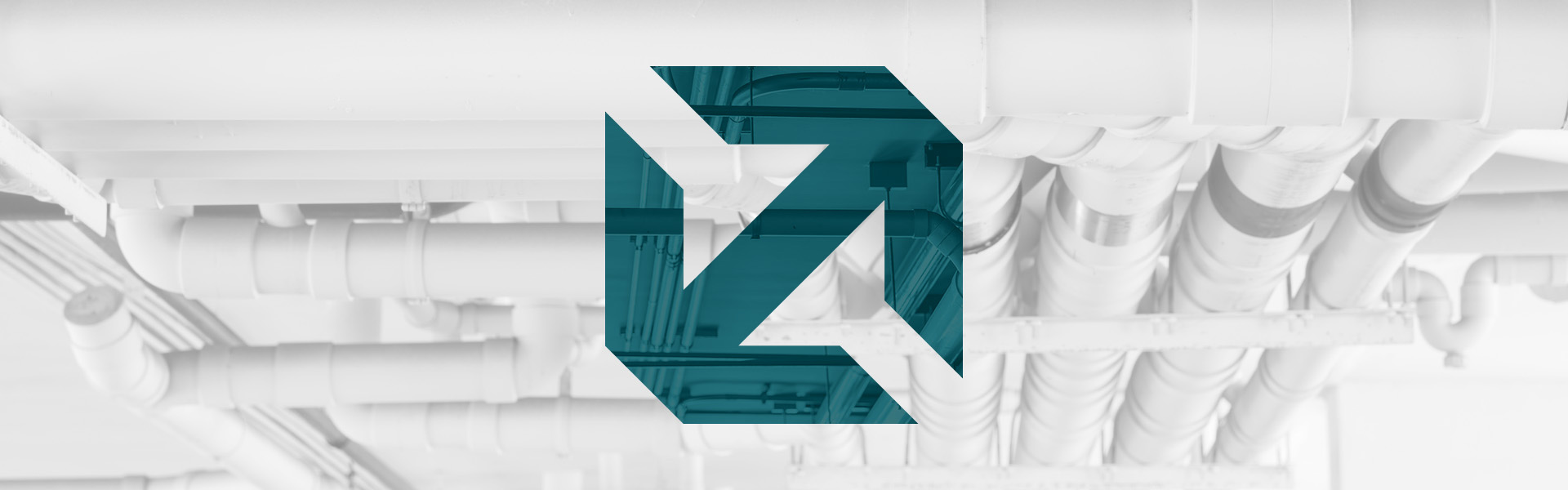
Logo and Brand Identity
Innero has two main profiles — the sale of equipment for engineering networks and their design. We found a solution that combined these areas of work and the engineering component became the point of contact. This is how the logo appeared — a synthesis of bright engineering elements: on one side — a stylized image of a fastener, and on the other — two connecting pipes. We complemented the complex visual symbol with a simple font solution, where the linear logo contrasts with the massive font. We took the logo sign as the basis of the corporate style, with which we experiment and show it in different variations, for example, a certain part or only an arrow. The main color is also not accidental — it is a shade of deep water, because Innero works directly with water. This is how a new brand was born, which "immerses" in the world of complex engineering solutions.
