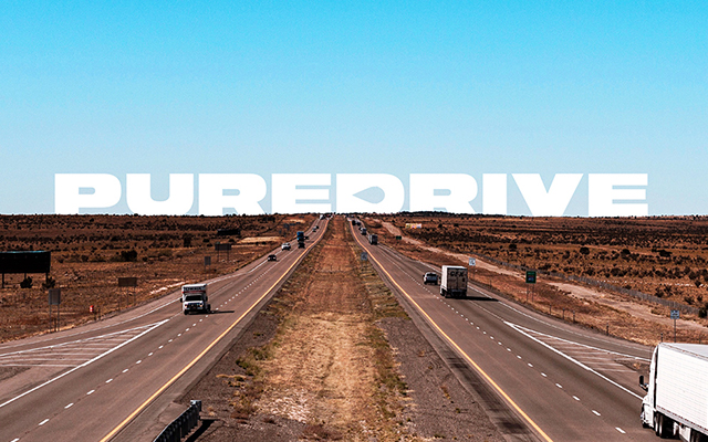
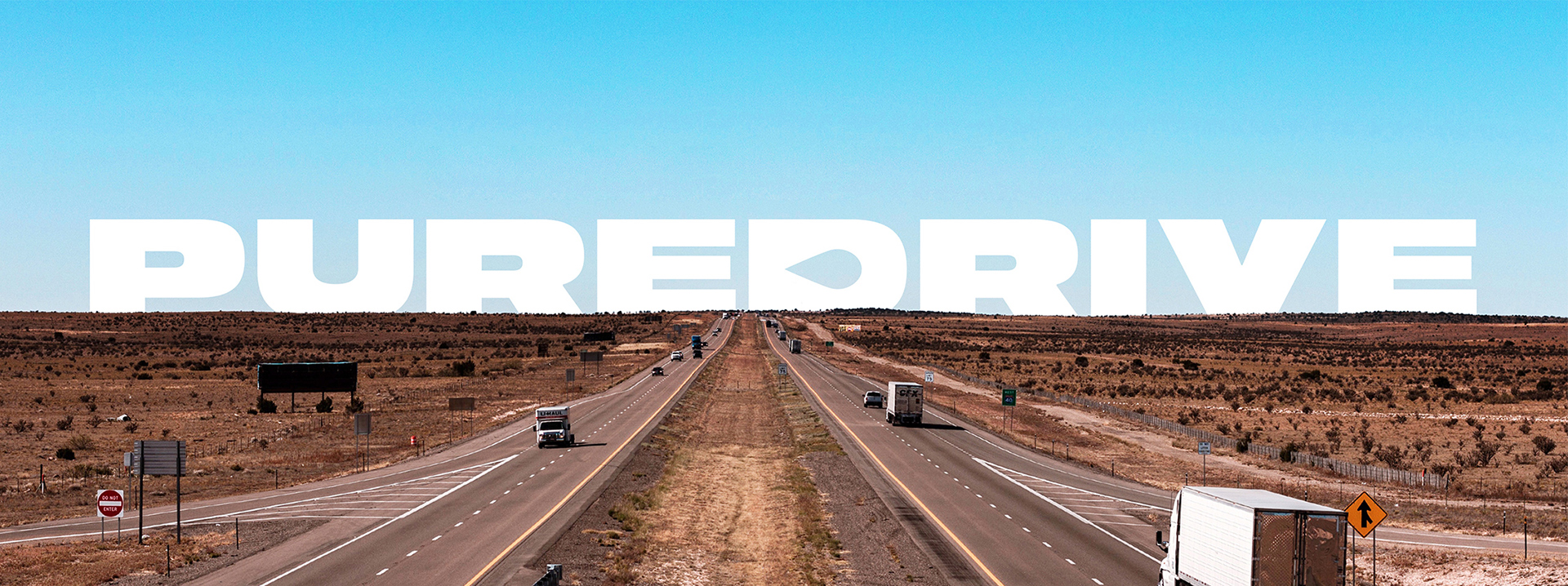
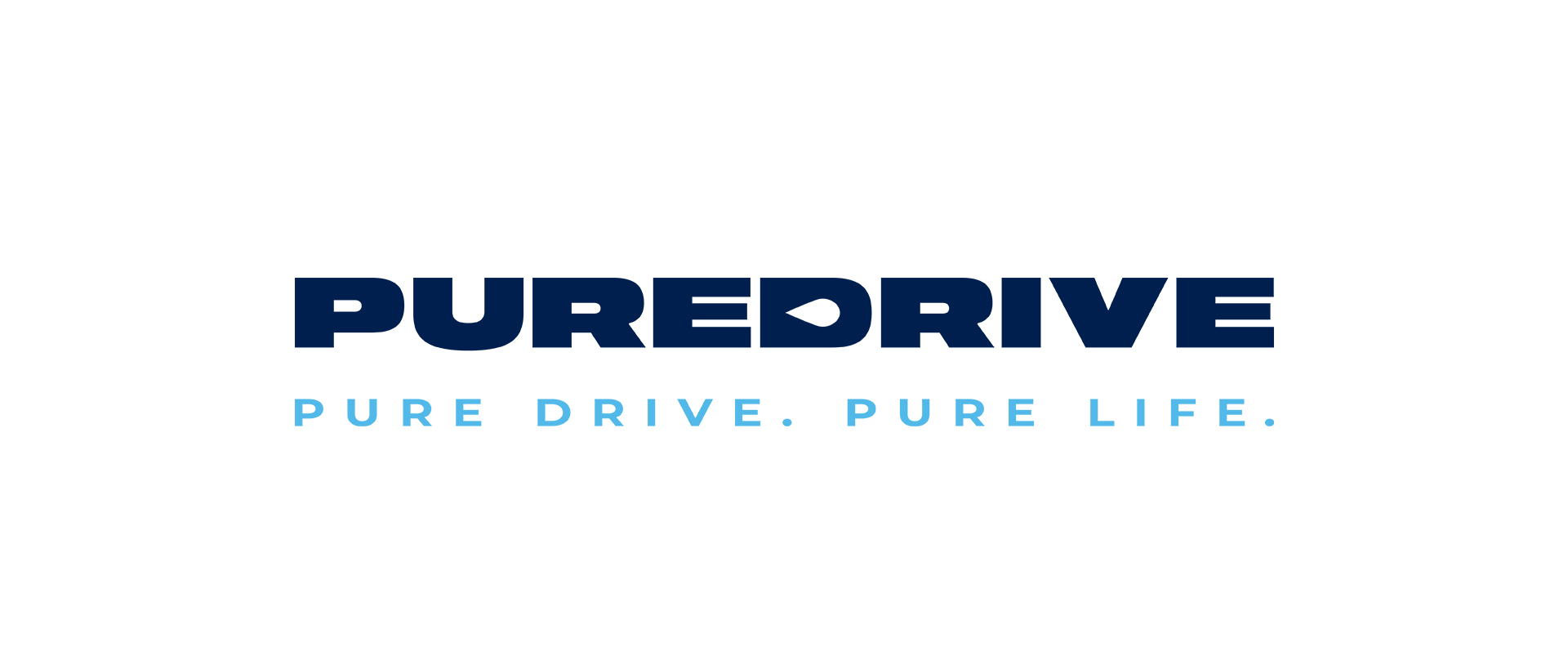
Solution
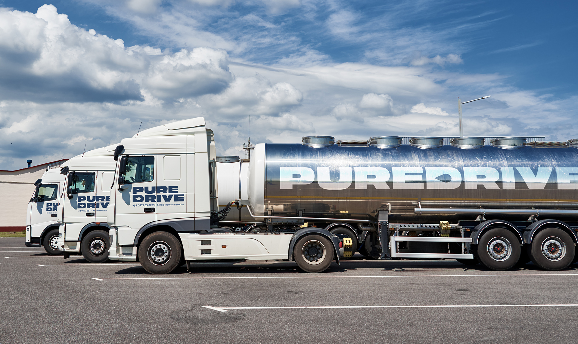
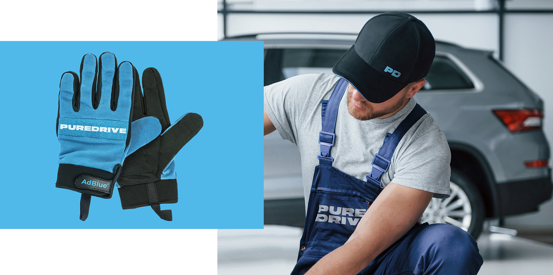
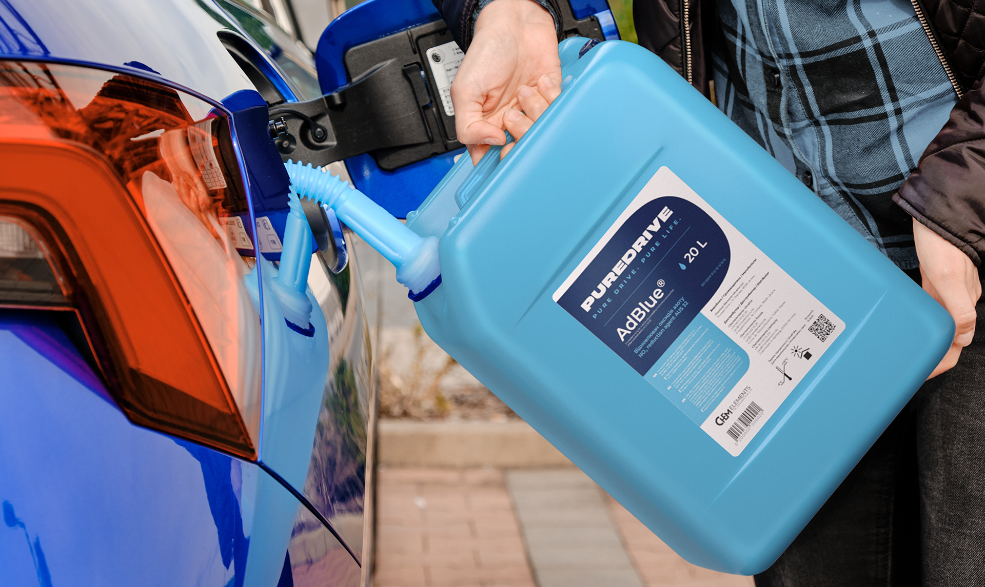
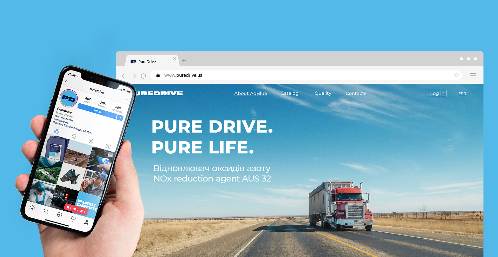
The PureDrive brand has a big goal — to gather a community of conscious people who care about their own health and the safety of the environment. Therefore, when choosing AdBlue® liquid on store shelves, the buyer should easily distinguish the reagent from other automotive products. For this, we created an expressive and simple font logo with a hint of the product itself in the form of a drop in the letter "D". It reads well in both small and large sizes and has several alternative builds for use in different situations. Dark blue and blue shades were used as company colors and to emphasize the environmental friendliness of the product. These colors are associated with cleanliness and air and successfully emphasize the brand's slogan "Pure drive. Pure life".