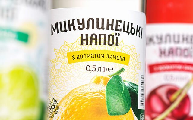
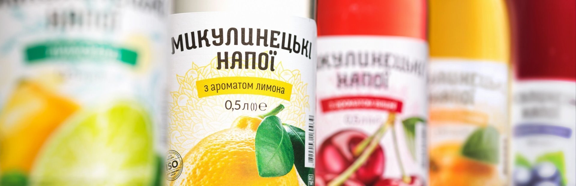


In cooperation with the company, we updated the design of the soft drinks labels, making them more modern, while preserving the position of elements familiar to the consumer. We decided to give more prominence to the bright juicy image of the fruit on the label, elegantly emphasizing them with the light thematic background patterns. The "M" mascot, which is present on all the manufacturer's products, became more simple and readable but still recognizable for the consumer. It got rid of extra details and took on a more neat pure form. The redesigned label highlights a number of brand benefits, the naturalness of the product being the major one.


Характерний для всієї продукції виробника знак «М» став більш лаконічним, читабельним, не втративши своєї впізнаваності. Позбувcя зайвих деталей та набув більш довершеної впорядкованої форми. Оновлений дизайн етикетки підкреслює цілий ряд переваг бренду, головною з яких є — натуральність продукту.


